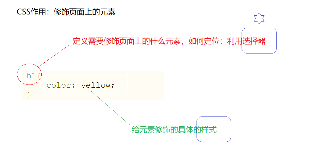
cascading style sheets
样式
行内样式(优先级最高)、内部样式、外部样式(最常用的)
1
2
3
4
5
6
7
8
9
10
11
12
13
14
15
16
17
18
19
20
21
22
23
24
25
26
| <!DOCTYPE html>
<html>
<head>
<meta charset="UTF-8">
<title></title>
<style type="text/css">
h1{
color: pink;
font-family: "宋体";
}
</style>
<link rel="stylesheet" type="text/css" href="css/样式.css" />
</head>
<body>
<h1 style="color: deeppink;font-family: '宋体';">This is a h1 title</h1>
</body>
</html>
|
选择器
1.基本选择器
1
2
3
4
5
6
7
8
9
10
11
12
13
14
15
16
17
18
19
20
21
22
23
24
25
26
27
28
29
30
31
32
33
34
35
36
37
38
39
40
41
42
43
| <!DOCTYPE html>
<html>
<head>
<meta charset="UTF-8">
<title></title>
<style>
h1{
color: red;
font-family: "楷体";
}
i{
color: blue;
font-family: "黑体";
}
.mycls{
color: green;
font-family: "宋体";
}
#myid{
color: yellow;
font-family: "微软雅黑";
}
</style>
</head>
<body>
<h1>我是<i>一个</i>标题</h1>
<h1>我是一个标题</h1>
<h1 class="mycls">我是一个标题</h1>
<h1>我是一个标题</h1>
<h2 class="mycls">我是h2标题</h2>
<h2>我是h2标题</h2>
<h2 id="myid">我是h2标题</h2>
</body>
</html>
|
效果
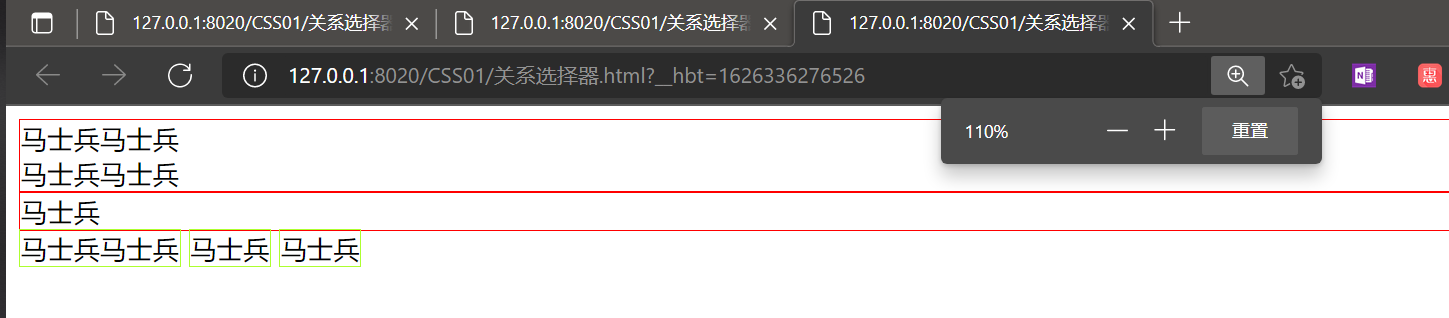
2.关系选择器
div和span标签
- div属于块级元素–》换行
- span属于行内元素–》没有换行效果:里面的内容占多大,span包裹的区域就多大
1
2
3
4
5
6
7
8
9
10
11
12
13
14
15
16
17
18
19
20
21
22
23
24
25
26
27
| <!DOCTYPE html>
<html>
<head>
<meta charset="UTF-8">
<title></title>
<style type="text/css">
div{
border: 1px red solid;
}
span{
border: 1px greenyellow solid;
}
</style>
</head>
<body>
<div>马士兵马士兵<br />马士兵马士兵</div>
<div>马士兵</div>
<span>马士兵马士兵</span>
<span>马士兵</span>
<span>马士兵</span>
</body>
</html>
|
效果:
选择器
1
2
3
4
5
6
7
8
9
10
11
12
13
14
15
16
17
18
19
20
21
22
23
24
25
26
27
28
29
30
31
32
33
34
35
36
37
38
39
40
41
42
| <!DOCTYPE html>
<html>
<head>
<meta charset="UTF-8">
<title></title>
<style type="text/css">
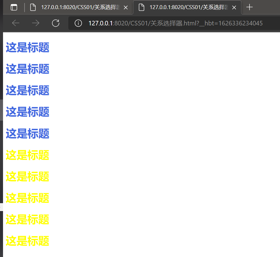
div>h1{
color: royalblue;
}
span>h1{
color: yellow;
}
</style>
</head>
<body>
<div>
<h1>这是标题</h1>
<h1>这是标题</h1>
<h1>这是标题</h1>
<h1>这是标题</h1>
<h1>这是标题</h1>
<span>
<h1>这是标题</h1>
<h1>这是标题</h1>
<h1>这是标题</h1>
<h1>这是标题</h1>
<h1>这是标题</h1>
</span>
</div>
</body>
</html>
|
效果:
3.属性选择器
1
2
3
4
5
6
7
8
9
10
11
12
13
14
15
16
17
18
19
20
21
22
23
24
25
| <!DOCTYPE html>
<html>
<head>
<meta charset="UTF-8">
<title></title>
<style type="text/css">
input[type="password"]{
background-color: red;
}
input[type="text"][value="zhaoss1"]{
background-color: yellow;
}
</style>
</head>
<body>
<form>
用户名:<input type="text" value="zhaoss1" />
用户名2:<input type="text" value="zhaoss2" />
密码:<input type="password" value="123123" />
<input type="submit" value="登录" />
</form>
</body>
</html>
|
4.伪类选择器
1
2
3
4
5
6
7
8
9
10
11
12
13
14
15
16
| <!DOCTYPE html>
<html>
<head>
<meta charset="UTF-8">
<title></title>
<style type="text/css">
.mycls:hover{
color: red;
}
</style>
</head>
<body>
<h1 class="mycls">我是标题</h1>
</body>
</html>
|
一般伪类选择器都应用在超链接上
1
2
3
4
5
6
7
8
9
10
11
12
13
14
15
16
17
18
19
20
21
22
23
24
25
26
27
28
29
| <!DOCTYPE html>
<html>
<head>
<meta charset="UTF-8">
<title></title>
<style type="text/css">
a:link{
color: yellow;
}
a:hover{
color: red;
}
a:active{
color: blue;
}
a:visited{
color: green;
}
</style>
</head>
<body>
<a href="index.html">超链接</a>
</body>
</html>
|
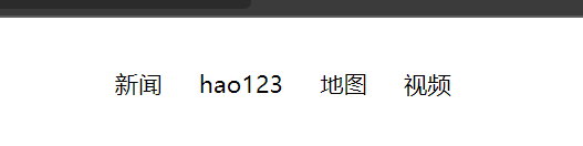
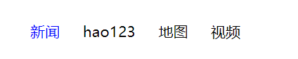
例子:百度导航条
1
2
3
4
5
6
7
8
9
10
11
12
13
14
15
16
17
18
19
20
21
22
23
24
25
26
27
28
29
30
31
32
33
34
35
36
37
38
39
40
41
42
43
44
45
46
47
| <!DOCTYPE html>
<html>
<head>
<meta charset="UTF-8">
<title></title>
<style type="text/css">
ul{
list-style-type: none;
}
li{
float:left;
margin-left: 20px;
}
a{
text-decoration: none;
font-size: 13px;
color: black;
}
a:hover{
color: #0000FF;
}
div{
position: absolute;
right:200px;
}
</style>
</head>
<body>
<div>
<ul>
<li>
<a href="aaaa">新闻</a>
</li>
<li>
<a href="aaaa">hao123</a>
</li>
<li>
<a href="aaaa">地图</a>
</li>
<li>
<a href="aaaa">视频</a>
</li>
</ul>
</div>
</body>
</html>
|
效果:
浮动效果
文字环绕图片
浮动设计的初衷为了解决文字环绕图片问题,浮动后一定不会将文字挡住,这是设计初衷,不能违背的。

原理
CSS 的 Float(浮动)使元素脱离文档流,按照指定的方向(左或右发生移动),直到它的外边缘碰到包含框或另一个浮动框的边框为止。文档流是文档中可显示对象在排列时所占用的位置/空间,而脱离文档流就是在页面中不占位置了。
语法

实例展示
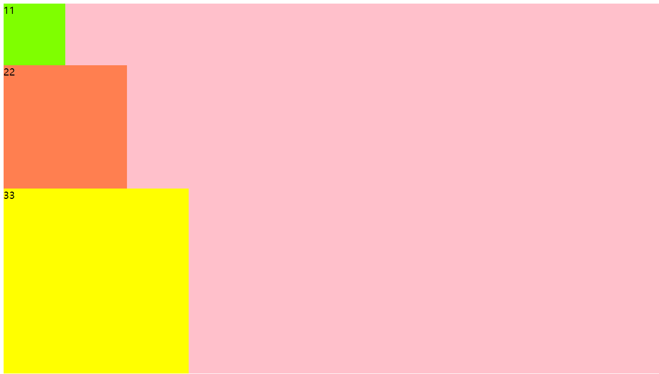
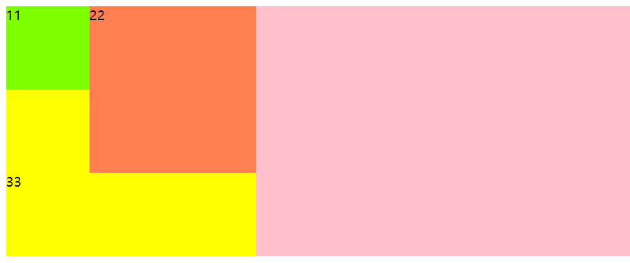
设置一个大的div,里面放三个小的div
1
2
3
4
5
6
7
8
9
10
11
12
13
14
15
| <!DOCTYPE html>
<html>
<head>
<meta charset="UTF-8">
<title></title>
</head>
<body>
<div style="background-color: pink;">
<div style="width: 100px;height: 100px;background-color: chartreuse;">11</div>
<div style="width: 200px;height: 200px;background-color: coral;">22</div>
<div style="width: 300px;height: 300px;background-color: yellow">33</div>
</div>
</body>
</html>
|
没有任何浮动
给绿div设置浮动
1
| <div style="width: 100px;height: 100px;background-color: chartreuse;">11</div>
|
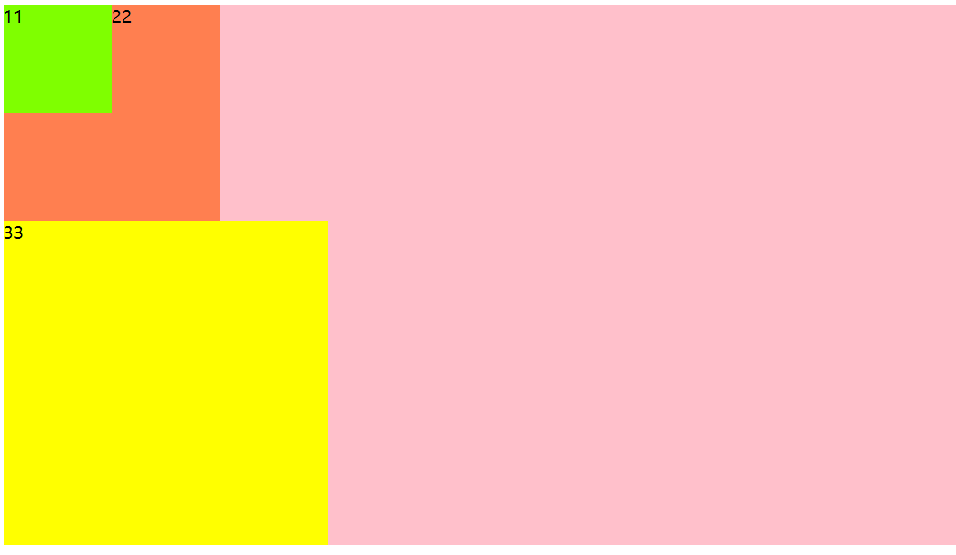
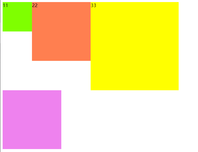
给橘色小块设置浮动
1
| <div style="width: 200px;height: 200px;background-color: coral;">22</div>
|
给黄色小块设置浮动
1
| <div style="width: 300px;height: 300px;background-color: yellow;float: left;">33</div>
|
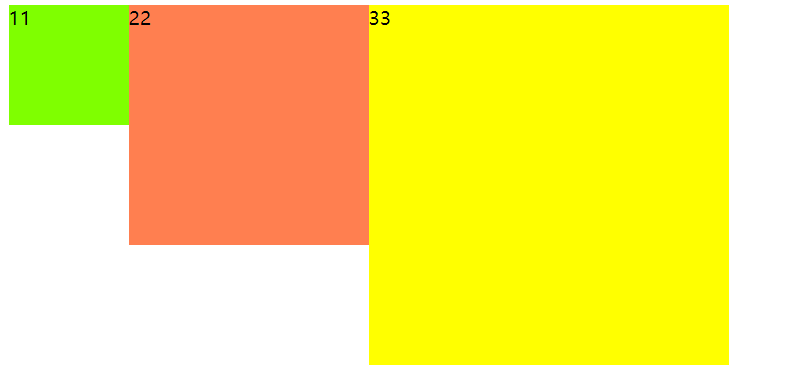
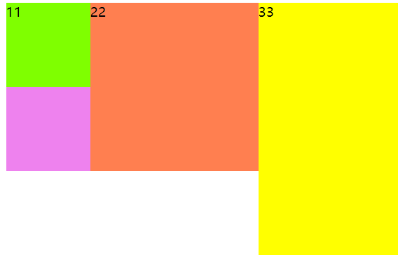
因为所有的小div都浮到上面,大div里没有东西填充,所以就消失了。
这样如果有其他的div块,就会变位置
消除浮动影响
给浮动的父节点加入一个属性overflow:hidden

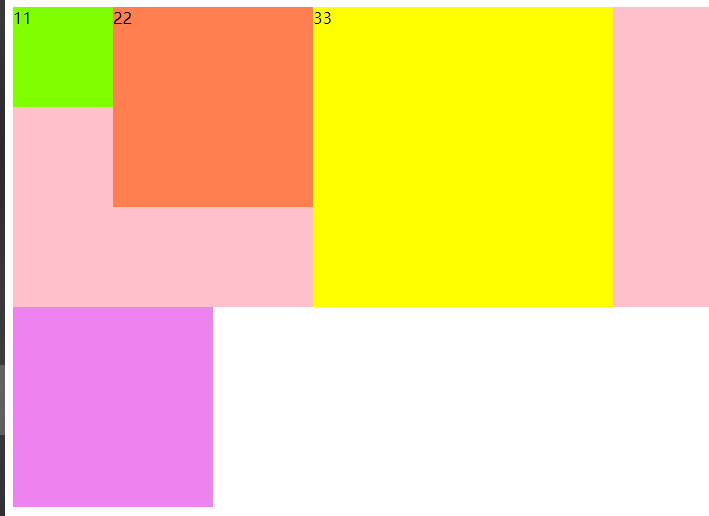
给父节点加一个高度,让粉色div“撑起来”

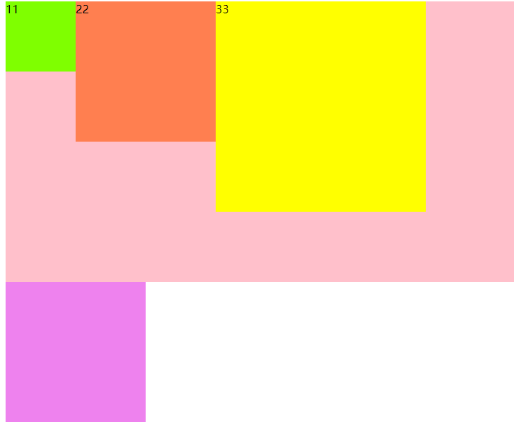
被影响的元素紫色div:给它加入一个属性clear:both;

定位
静态定位(static)
就是默认的定位
1
2
3
4
5
6
7
8
9
10
11
12
13
| <!DOCTYPE html>
<html>
<head>
<meta charset="UTF-8">
<title></title>
</head>
<body>
<img src="img/1.jpg" style="position: static;" />
</body>
</html>
|
相对定位(relative)
相对元素自身所在的原来的位置进行定位,可以设置left,color,bottom,top这四个属性
1
2
3
4
5
6
7
8
9
10
11
12
13
14
15
16
17
18
| <!DOCTYPE html>
<html>
<head>
<meta charset="UTF-8">
<title></title>
</head>
<body>
<div style="width: 500px; height: 500px; background-color: pink;">
<div style="width: 100px; height: 100px; background-color: green;"></div>
<div style="width: 100px; height: 100px; background-color: red; position: relative; bottom: 10px;" ></div>
<div style="width: 100px; height: 100px; background-color: blue;"></div>
</div>
</body>
</html>
|
z-index属性:
设置堆叠顺序,设置元素谁在上谁在下。注意:z-index属性要设置在定位的元素上,
应用场合:
(1)元素在小范围移动的时候
(2)结合绝对定位使用
绝对定位(absolute)
1
2
3
4
5
6
7
8
9
10
11
12
13
14
15
16
17
18
19
20
21
22
23
24
25
26
27
28
29
30
31
32
33
34
| <!DOCTYPE html>
<html>
<head>
<meta charset="UTF-8">
<title></title>
<style type="text/css">
#outer{
width: 500px;
height: 500px;
background-color: pink;
margin-left:300px;
}
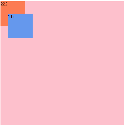
#div01{
width: 100px;
height: 100px;
background-color: cornflowerblue;
position: absolute;
left: 30px;
top: 50px;
}
#div02{
width: 100px;
height: 100px;
background-color: coral;
}
</style>
</head>
<body>
<div id="outer">
<div id="div01">111</div>
<div id="div02">222</div>
</div>
</body>
</html>
|
效果

蓝色div相对body产生的位移,相对body进行位置的改变,然后蓝色div发生位移以后,原位置得到了释放。橙色div移动上去了!
- 实际开发中,我们往往让蓝色div在粉色div中发生位移效果
配合定位来使用:
1
2
3
4
5
6
7
8
9
10
11
12
13
14
15
16
17
18
19
20
21
22
23
24
25
26
27
28
29
30
31
32
33
34
35
36
| <!DOCTYPE html>
<html>
<head>
<meta charset="UTF-8">
<title></title>
<style type="text/css">
#outer{
width: 500px;
height: 500px;
background-color: pink;
margin-left:300px;
position: relative;
}
#div01{
width: 100px;
height: 100px;
background-color: cornflowerblue;
position: absolute;
left: 30px;
top: 50px;
}
#div02{
width: 100px;
height: 100px;
background-color: coral;
}
</style>
</head>
<body>
<div id="outer">
<div id="div01">111</div>
<div id="div02">222</div>
</div>
</body>
</html>
|
效果
总结:
当给一个元素设置了绝对定位的时候,它相对谁变化呢?它会向上一层一层的找父级节点是否有定位,如果直到找到body了也没有定位,那么就相对body进行变化,如果父级节点有定位(绝对定位,相对定位,固定定位),但是一般我们会配合使用父级为相对定位,当前元素为绝对定位,这样这个元素就会相对父级位置产生变化。无论是上面的哪一种,都会释放原来的位置,然后其他元素会占用那个位置。
开发中建议使用:父级节点relative定位,子级节点使用绝对定位。
固定定位(fixed)
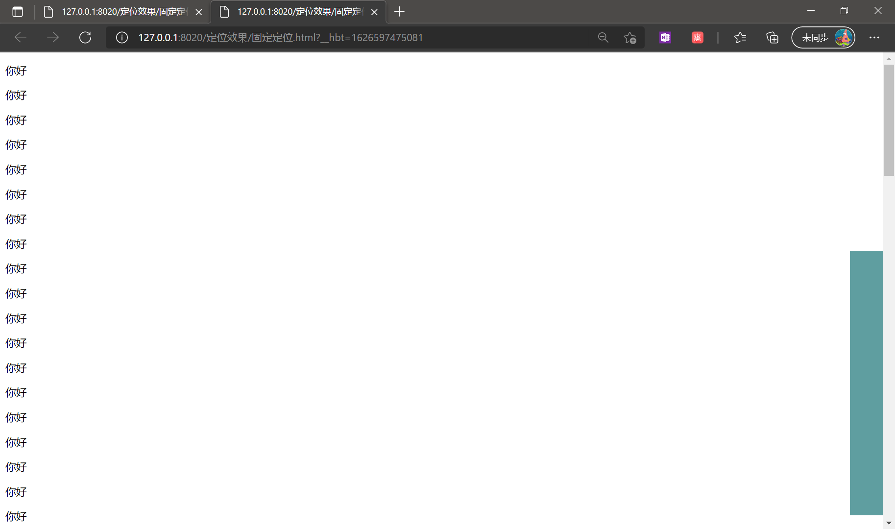
应用场合:在页面过长的时候,将某个元素固定在浏览器的某个位置上,当拉动滚动条的时候,这个元素位置不动。
1
2
3
4
5
6
7
8
9
10
11
12
13
14
15
16
17
18
19
20
21
22
23
24
25
| <!DOCTYPE html>
<html>
<head>
<meta charset="UTF-8">
<title></title>
<style type="text/css">
#mydiv{
width: 50px;
height: 400px;
background-color: cadetblue;
position: fixed;
right: 0px;
top: 300px;
}
</style>
</head>
<body>
<div id="mydiv"></div>
<p>你好</p>
...(省略很多行)
<p>你好</p>
</body>
</html>
|
效果
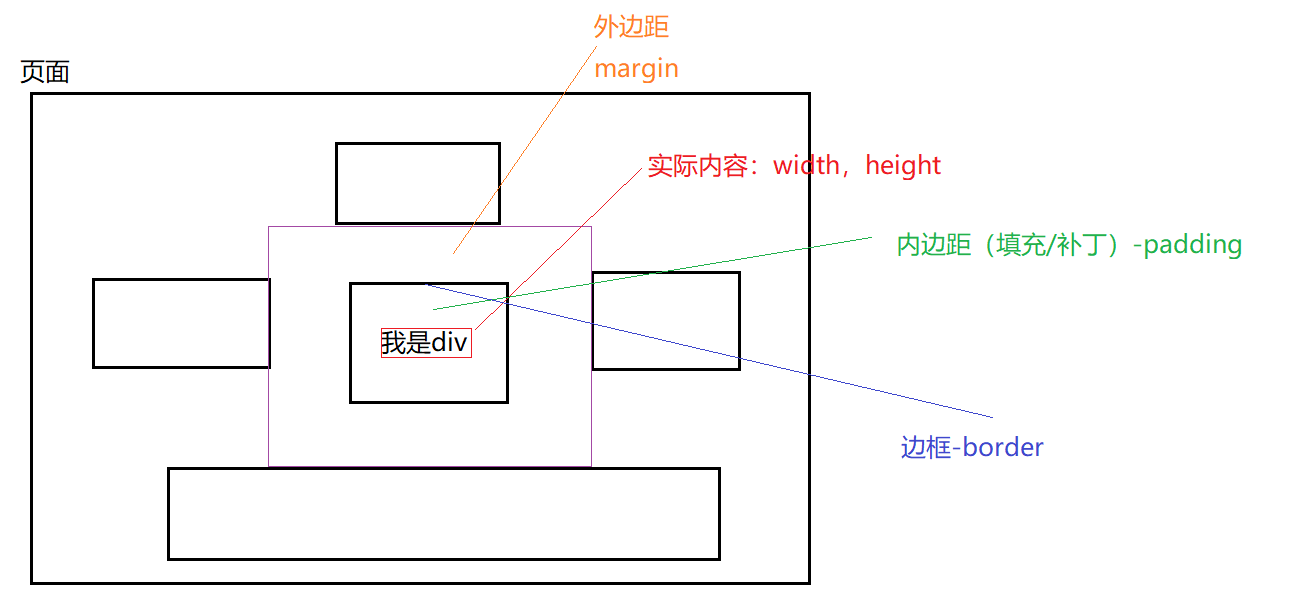
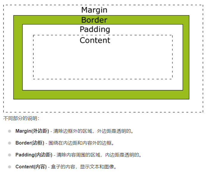
盒子模型
页面上也有很多元素,元素之间的布局/设计 依靠 盒子模型:
所有HTML元素可以看作盒子,在CSS中,”box model”这一术语是用来设计和布局时使用。
CSS盒模型本质上是一个盒子,封装周围的HTML元素,它包括:边距,边框,填充,和实际内容。
盒模型允许我们在其它元素和周围元素边框之间的空间放置元素。
下面的图片说明了盒子模型(Box Model):
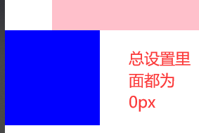
感受盒子模型
1
2
3
4
5
6
7
8
9
10
11
12
13
14
15
16
17
18
19
20
21
22
23
24
25
26
27
28
29
30
31
32
33
34
35
36
37
38
39
40
41
42
43
| <!DOCTYPE html>
<html>
<head>
<meta charset="UTF-8">
<title></title>
<style type="text/css">
*{
margin:0px;
padding: 0px;
border: 0px;
}
#outer{
width:450px;
height: 450px;
background-color: pink;
margin-left: 50px;
margin-top: 50px;
padding-left: 50px;
padding-top: 50px;
}
#mydiv{
width: 60px;
height: 60px;
background-color: yellowgreen;
padding-left: 40px;
padding-top: 40px;
}
</style>
</head>
<body>
<div id="outer">
<div id="mydiv">111</div>
</div>
<div style="background-color: blue;width: 100px; height: 100px;"></div>
</body>
</html>
|
注意修改了内边距以后需要修改原本的长和宽
效果

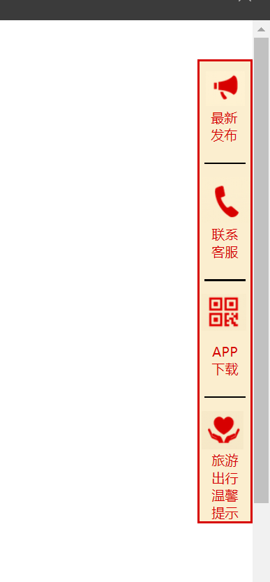
H+C练习
1
2
3
4
5
6
7
8
9
10
11
12
13
14
15
16
17
18
19
20
21
22
23
24
25
26
27
28
29
30
31
32
33
34
35
36
37
38
39
40
41
42
43
44
45
46
47
48
49
50
51
52
53
54
55
56
57
58
59
60
61
62
63
64
65
66
67
68
69
70
71
72
73
74
75
76
| <!DOCTYPE html>
<html>
<head>
<meta charset="UTF-8">
<title></title>
<style type="text/css">
#bigdiv{
width: 65px;
border: solid #D70000 ;
background-color:#FBEECF ;
font-size: 17px;
font-family: "微软雅黑";
color: #D70000;
position: fixed;
right: 0px;
top: 50px;
}
#mydiv{
height: 60px;
background: url(img/小喇叭.png) no-repeat 8px 12px;
padding-top: 60px;
padding-right: 2px;
text-align: center;
}
#mydiv2{
height: 60px;
background: url(img/联系客服.png) no-repeat 3px 8px;
padding-top: 70px;
text-align: center;
}
#mydiv3{
height: 60px;
background: url(img/二维码.png) no-repeat 3px 8px;
padding-top: 70px;
text-align: center;
}
#mydiv4{
background: url(img/呵护.png) no-repeat 3px 8px;
padding-top: 60px;
text-align: center;
}
</style>
</head>
<body>
<div id="bigdiv" >
<div id="mydiv">
最新<br />发布
</div>
<hr width="50px" align="center" color="black" />
<div id="mydiv2">
联系<br />客服
</div>
<hr width="50px" align="center" color="black" />
<div id="mydiv3">
APP<br />下载
</div>
<hr width="50px" align="center" color="black" />
<div id="mydiv4">
旅游<br />出行<br />温馨<br />提示
</div>
</div>
<p>hello</p>
...省略很多个hello
<p>hello</p>
</body>
</html>
|
效果: